Now a day’s Responsive web layout is obtaining astounding attention, as this sort of design is well befitting from desktop to smartphone. Now people are very enamored of using smartphone, they are surfing internet from any location using their smartphones and tablets. So as a Creative Website Designing firm it should be pursued that the websites layout should be congenial in smartphones as well as in tablets along with desktop computer.
As a promising Responsive Web Design Firm Dehradun, Emarkepedia generally sustains some measures or practices which will ensure the resilience of your proposed responsive design, these are as follows.
As far as Responsive web layout design is concern it should be adaptable to all resolution devices. So it is required to plan to organize the proposed Responsive web layout content delicately to ensure how conveniently it can be shown on different devices, especially in smartphones and tablets without making any visual hindrance.
As an aspiring Creative Website Designing firm we always accentuate on this concern to deliver a dignified responsive business website. To be very specific if your page incorporate 3 column in a row then it would turn out as 2 column in a row for tablet and 1 column on mobile device, so the one extra column will be wrapped to the next row. Hence the concept of grid has been popularized. One of the most stunning, dazzling and elegant framework which will assure all the above mentioned concern and it is known as bootstrap framework. This one will adjust your page content as per the resolution using media queries and fluid grid concept.
This one is the most important facet as far as web mobile design is concern. If we contemplate higher resolution devices like laptop or desktop, the image size should be bulkier. If we intend to adopt cramped image in a higher resolution then that image will be distorted. So it is being stated to use same image of distinct sizes for contrasting resolutions.
It is an important aspect of responsive web layout designing. As during Responsive Web Design we need to stipulate the range of media query values, so it will be conformed or legitimate CSS file will be assassigned as per the screen resolution of any precise device. So break point can be considered as the transition between the media query values like if the screen resolution is 780px then the menu bar will exhibit else it will be aroused as a drop down menu. Some key breakpoints which are needed to be considered as follows:
<480px (which applies to older, smaller smartphone screen sizes)
<768px, which is ideal for larger smartphones and smaller tablets
>768px, which applies for everything bigger such as large tablet screens and desktops screens.
As far as responsive business website designing is concerned, Designer need to use web font like FONT AWESOME for icons to be used as SVG rather conventional use of images. This web font package is hoarded as a folder in server and can be imported using @font-face rule. The leverage of using the web font is that the icons will cope up with any resolution of devices.
This one is the foremost decisive aspect of responsive web layout design. Today mobile users use high speed internet connection in their device which is reasonably fast. So you have to take care that your proposed site should have fast loading time which Google is now recognizing as one of the important aspect for higher rankings. So many Creative Website Design Agencies are seeking out the resolution of one extensive query which is “how to boost up the speed of any site on mobile?”You can test your proposed site using GOOGLE PAGE SPEED INSIGHTS TOOL and the PINGDOM & Web Page SPEED TEST TOOL. Both of these will produce a report which will be evaluate your page load speed time and overture some sorts of recommendations on how to reform it.
In a larger screen all the content and element will be presented with ease. But if you deal with the small screen like mobile and tablet, there is not ample space to display all of it. So it is required to be selective to elect which one will be shown or hide.
Internet has influenced every living human on this planet. Basically, it has changed the way we think and interpret. With access to humungous information, the world has considerably shrunk, and shrunk for good. This huge internet database has been successfully bifurcated into ‘websites’ whilst these web domains have their own further classifications. It’s all systematic. With access to practically every kind of info over these myriads of websites, this virtual world has seeped into every nook and corner.
With Google as the most ‘favored’ search engine, for every search query, we are rendered with thousands of websites to look into. But, in a jungle of web domains, what stands out the most? What possibly catches your eye and attention?! It is the design of the website along with its layout and usability.
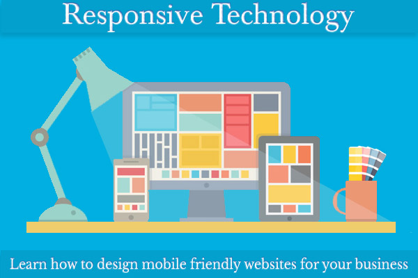
Nowadays, smartphones are quintessential for an average human’s subsistence. Accordingly, web sites have also molded themselves. With Responsive technology playing its crucial role, websites are enabled to be accessed over by portable gadgets like I pads as well.
If any mobile development company overpasses it then it will drop astronomical number of valid visitors. Now a day’s almost all Mobile designing firms are contemplating couple of frameworks which makes their task bit easier to build up the Responsive Web Design which will be accommodated to any resolution of devices
Most people depend on internet to find and purchase their essential commodities online rather go…
The modern drift is that each of your customers should access your proposed product or…
Google is altering its algorithm incessantly, and it is apparent now to form content which…
A CMS-Content Management System is an imperative facet of any serious website. Your proposed business…
Social Media Marketing is an influential tool which will enhance your customer base significantly. But…
SEO stands for search engine optimization which ensure the increase discernability of your webpage or…
This website uses cookies.